Thursday, February 19, 2015

T 2, 2.19

A Visual Sound


Charlie Parker may best be known for his contribution to bebop jazz. Creating the spin-off genre, Charlie influenced a great deal of musicians all around the country. In a tribute to his legacy, I plan to create an exhibit reflecting on his core values and contributions to bebop. My floor plan is divided into three sections in hope to symbolically center Charlie's life in the middle of the exhibit. By using spinning doors and glass to separate the space instead of walls, I hope to portray the transparent effect the music industry had on Charlie's life, and the impact Charlie hand within the industry.

The ends of the building will be dedicated to bebop jazz only. Its origins, impact, sound and symbolism will be displayed in the two wings. The glass room in the center is specifically for the life of Charlie Parker. Viewers from outside the building will be able to look into this space, as many outsiders were able to judge the life Charlie lead. It is a way to intrigue people to enter and better understand Charlie's place in the world, the world of music.

I want to utilize spinning doors as a means to place graphics and art. The motion that a door has can be paralleled to bebop music, having a slow or fast tempo depending on the audience flow and time of day. Doors also symbolize many things such as new leafs, passageways, and continuance. All present in Charlie's life.

Visually I want to use white space to emphasis colorful artwork and type. I hope to use wire to mold art as well as construct the doors. Creating a space almost with a feel f industrial design.


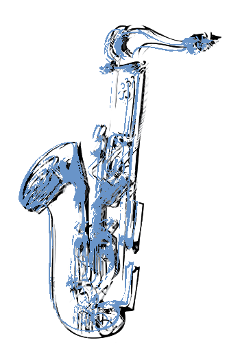


 this is what I am thinking of for the image bellow


Tuesday, February 17, 2015

T 2, 2.17 inspiration

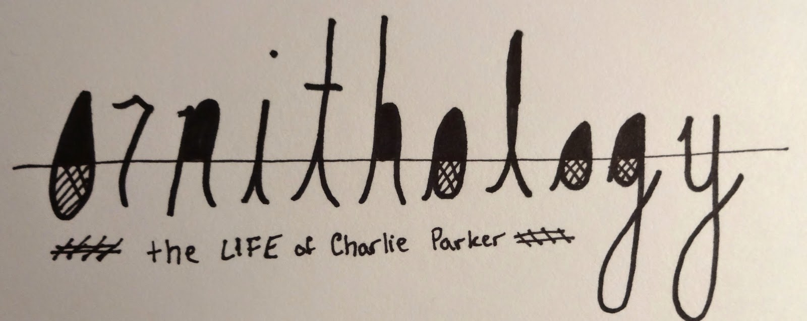
For our second project we are creating an exhibition space. The subject circles around Charlie Parker and his career in jazz. From the exterior, to the inside walls, layout, art pieces and decor, it is our job to design the entire space. Here are a few pieces of inspiration I have found to help my designs. 


Thursday, February 12, 2015

T 2, 2.12, P1 Final

After weeks of work, critiques and adjustments, our first is complete. By re-designing a Rice Krispies cereal box, I looked at form and how type is affected when placed on a 3-Demential surface. My cereal boxes are focused on the unique differences between them, highlighted by the Gestalt principle, emphasis. I wanted each box to have a dominate design or packaging as well as clean craft. I wanted to give meaning to sayings such as "Simple good fun" by bringing them to light for the consumer. 

Referencing the bellow pictures, each design is geared towards an attribute and hopes to convey feeling. On the left I longed for the box to feel confident and interdependent. The red RICE is meant to catch your eye, while the handwritten words suggest a relaxed narrative in contrast to the shouting color. This arrangement I very so much enjoy.

I have decided to propose the center box for it utilizes white space to create comfort and energy at the same time. By leaving the front of the box clear and created a cloud of words on the back, there is a nice contrast that allows for both attributes to be noticed. I chose brown due to its organic nature. And thought it pared well with the hand lettering. 

My last box is meant to display information. I wanted to leave the background white so that the consumer could easily read the text. On the other hand, I thought that adding color to the text would help highlight the importance of certain words. The overlapping of the type and the way it wraps around the edges was purposefully designed so that it seamed a little industrial and manufactured. 

Overall, I enjoyed worked with the 3-Demential shape and feel I now have a much greater appreciation for designers who venture beyond the restricted, 2D, and try their craft at objects that are meant to be held and rotated in hand. You have to visualize as well as allow yourself to break boundaries and walls, wrap around curves and edges. I hope to continue to apply this new experience to other projects. 


Monday, February 9, 2015

T 2, 2.10

Experimentation with Photography

After refining my designs from our last class critique and a bit of last minute experimenting, I tried to push my designs further to express the attributes I wanted them to have. Below I have posted my boxes in different photographic environments tailing to those attributes. Each image has a brief description regarding the context and significance behind it. 

A few quick notes:My final designs were not completed until tonight, therefore a few of the images shown have my old mock-up boxes. Also, with the photographs including cereal, I used Cheerios in place of Rice Krispies for I did not have any in stock. But, for the real images, I will make sure to have the appropriate cereal. These were to act more as test images, not final images. 


(Left to right) Comfort, confidence, informative


With this image I use a patterned background that was soft and comforting to highlight this boxes attribute.


Front and back of proposed box: Comfort 


An attempt to create an "in context" image. Did not work out as thought.


Informative 


Confidence, being shown on a red background to complement the red type. The red almost takes away from the box, giving it less confidence. 


Confidence, shown to scale


Confidence, front and back


Confidence, close up


Comfort in context


Confidence in context


Left over attempts:


Monday, February 2, 2015

T 2, 2.3

For type 2 we printed off our first drafts and constructed them to be their end 3D form. I ended up using the heavy weight paper and I hope to mount it to bristle board for the final product. 


Informational:


Comfort:


Confidence:


T 2, 1.28

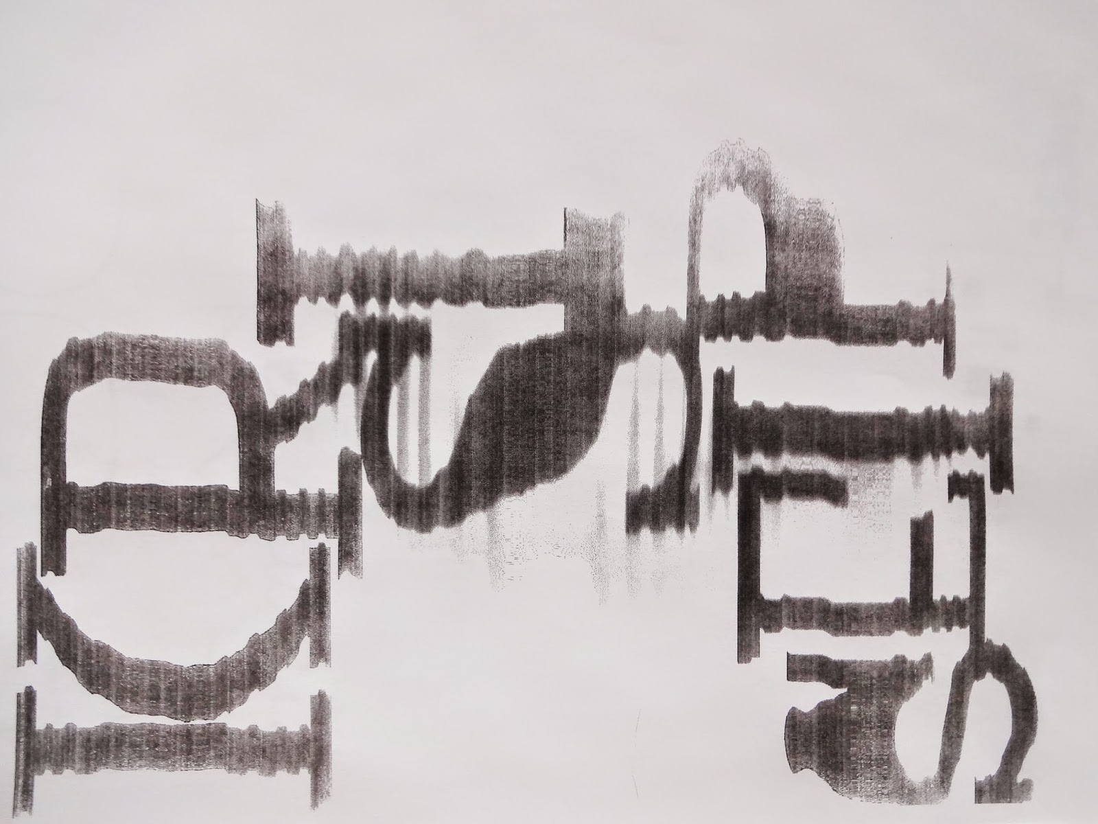
After staring at the screen for way to long, I decided to manipulate type via the scanner/copier at my house. It is an old HP scanner and I was hopping the age would show through the prints. Here are a few of the scans I made. I found that by moving the paper side to side slightly, and by randomly shuffling it up and down, you could create an organic, almost industrial look to the type. Also, by lowering and raising the lid slightly here and there, the quality would decrees or increase. Personally, I enjoy the stretching of the last scan and hope to use it for the cereal box design in my type 2 class.